TsUMIKI
[Visual Impact] Section Design
[Visual Impact] Section Design
Couldn't load pickup availability
Product Name: Second Section lot.00007
Model: NO.7
◆Concept: Visual Impact
◆Date of Creation [Date of Creation]: 2024/03/25
◆Characteristics
- Intuitive and visually appealing design.
-
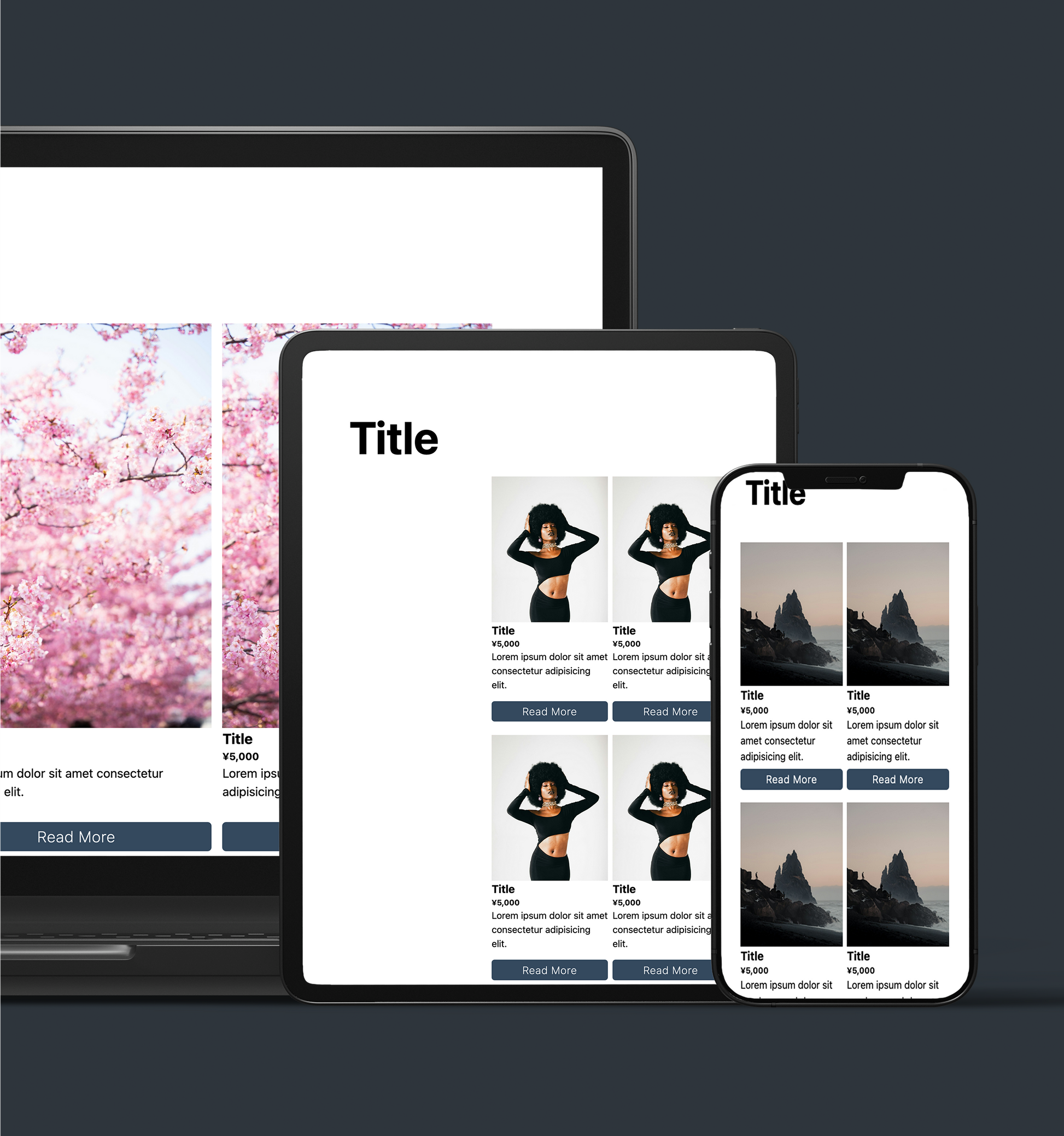
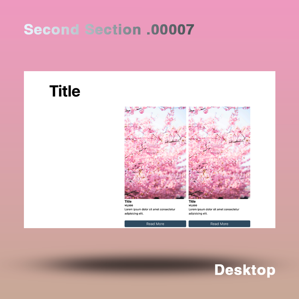
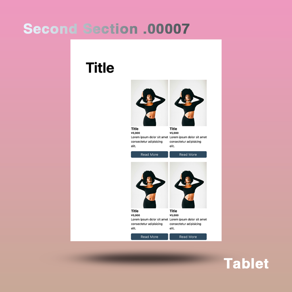
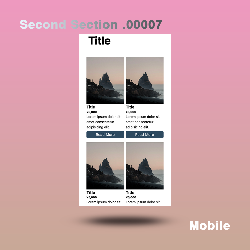
Layouts adapted for each device (desktop, tablet, mobile).
-
A combination of images and text effectively communicates information.
-
Its simple and modern design grabs the user's attention.
- Linkable via button
- Each button should have a link so visitors can easily take the next step.
- The buttons are designed to be eye-catching and easy to click.
- Responsive design ensures comfortable viewing on desktop, tablet and mobile devices.
- Provides optimal layout for each device.
- Regular website version: Header / None
- Shopify version: Header / None
◆Outline [Overview/Concept]
The concept is "Visual Impact"
overview:
The design is all about maximizing visual impact. The desktop version uses cherry blossom images to create a festive look, the mobile version uses natural landscape images to create a relaxing atmosphere, and the tablet version uses stylish portrait images to create a modern look.
Points to keep in mind:
-
Incorporate the latest design trends:
- It features a modern and simple design.
- Design the perfect layout for each device.
-
Enhance visual impact:
- Use large images to grab the user's attention.
-
Improved user experience:
- The responsive design allows for comfortable viewing on any device.
- Offers intuitive navigation.
-
Effective communication:
- Combine images and text to provide visual information.
- Main titles etc. are clearly indicated.
-
Easy to use:
- Set up a link from a button to make it easier to take the next step.
- The buttons are designed to be prominently placed.
Design elements:
-Background and color palette: Subdued colors are used to emphasize visibility and a unified design.
-typography: A modern and simple font is used to achieve both visibility and style.
-Layout: Different layouts are used for each device, organizing the information in an easy-to-understand manner.
-link: Each piece of content should have a link so that visitors can easily access the information they are looking for.
◆Place of use: Can be used from the second level onwards
◆Language: html, css, javascript, Liquid
◆File Structure:
【Usual Web Page】
...
your project/
├── css
│ ├── reset.css
│ └── style.css
├── docs
│ ├── ReadMe_en.md
│ ├── ReadMe_en.pdf
│ ├── ReadMe_jp.md
│ └── ReadMe_jp.pdf
├── image
│ ├── image01.jpg
│ ├── image02.jpg
│ ├── image03.jpg
│ ├── image04.jpg
│ ├── image05.jpg
│ └── image06.jpg
├── index.html
└──js
└── main.js
...
5 directories, 14 files
[Shopify]
...
your project/
├── assets
│ ├── css
│ │ ├── reset.css
│ │ └── sec_section_00007_style.css
│ └── js
│ └── sec_section_00007_main.js
├── docs
│ ├── ReadMe_en.md
│ ├── ReadMe_en.pdf
│ ├── ReadMe_jp.md
│ └── ReadMe_jp.pdf
├── image
│ ├── image01.jpg
│ ├── image02.jpg
│ ├── image03.jpg
│ ├── image04.jpg
│ ├── image05.jpg
│ └── image06.jpg
└── secondSection00007.liquid
...
6 directories, 14 files
Materials
Materials
Shipping & Returns
Shipping & Returns
Dimensions
Dimensions
Care Instructions
Care Instructions
Share
![[Visual Impact] Section Design](http://artiqova.site/cdn/shop/files/secondSection00007.png?v=1721638244&width=1445)
![[Visual Impact] Section Design](http://artiqova.site/cdn/shop/files/desktop_6bd33dae-9bc5-413c-b64a-5a1b495b3b92.png?v=1721638244&width=1445)
![[Visual Impact] Section Design](http://artiqova.site/cdn/shop/files/tablet_50cb7c4e-1304-4a7c-b911-2370fc6ba1ae.png?v=1721638243&width=1445)
![[Visual Impact] Section Design](http://artiqova.site/cdn/shop/files/mobile_d5a40e10-9e21-4f76-b8e6-de5e272a72cd.png?v=1721638244&width=1445)
