TsUMIKI
[Simple Grid Layout] Section Design | Section Design
[Simple Grid Layout] Section Design | Section Design
Couldn't load pickup availability
Product Name: Second Section lot.00001
Model: NO.1
◆Concept: Simple Grid Layout
◆Date of Creation [Date of Creation]: 2024/03/19
◆Characteristics
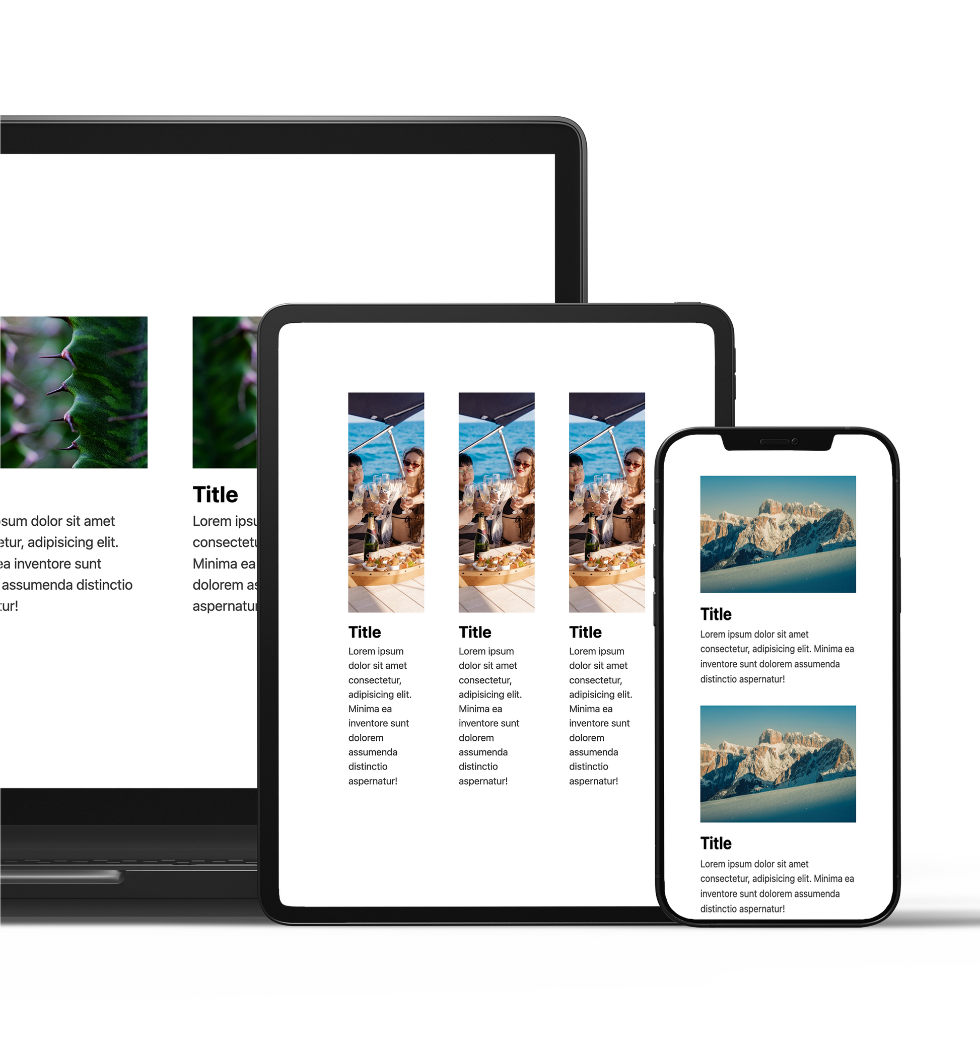
- The screen layout will be different on different devices (desktop, tablet, mobile).
- It features a clean and modern grid layout.
- Visually organize and display your products and content.
- The combination of images, titles, and text provides information in an easy-to-understand manner.
- It is responsive and can be viewed comfortably on any device.
- Regular website version: Header / None
- Shopify version: Header / None
◆Outline [Overview/Concept]
This design is based on the theme of "simple grid layout."
The content will be rearranged depending on the device, providing your visitors with an optimal viewing experience.
overview:
The concept of "Simple Grid Layout" is a simple grid layout. With an emphasis on the ease of viewing for visitors, this product is purposely motionless and has a simple design.
From the second row onwards, this section before the footer is ideal for introducing your blog.
Points to keep in mind:
-
Different layouts for different devices:
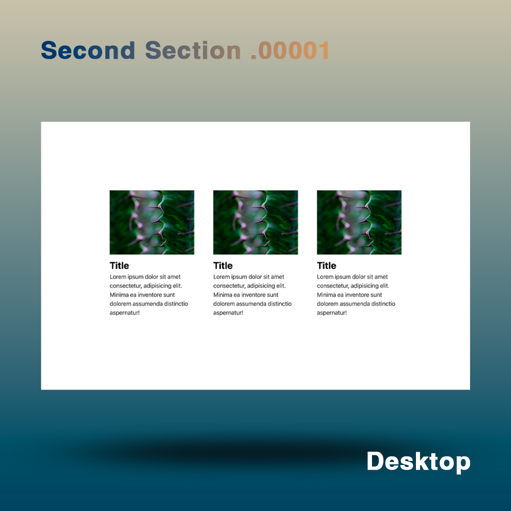
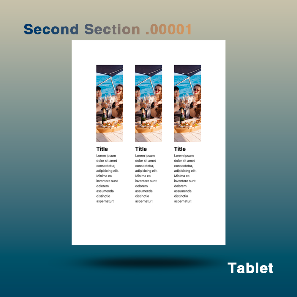
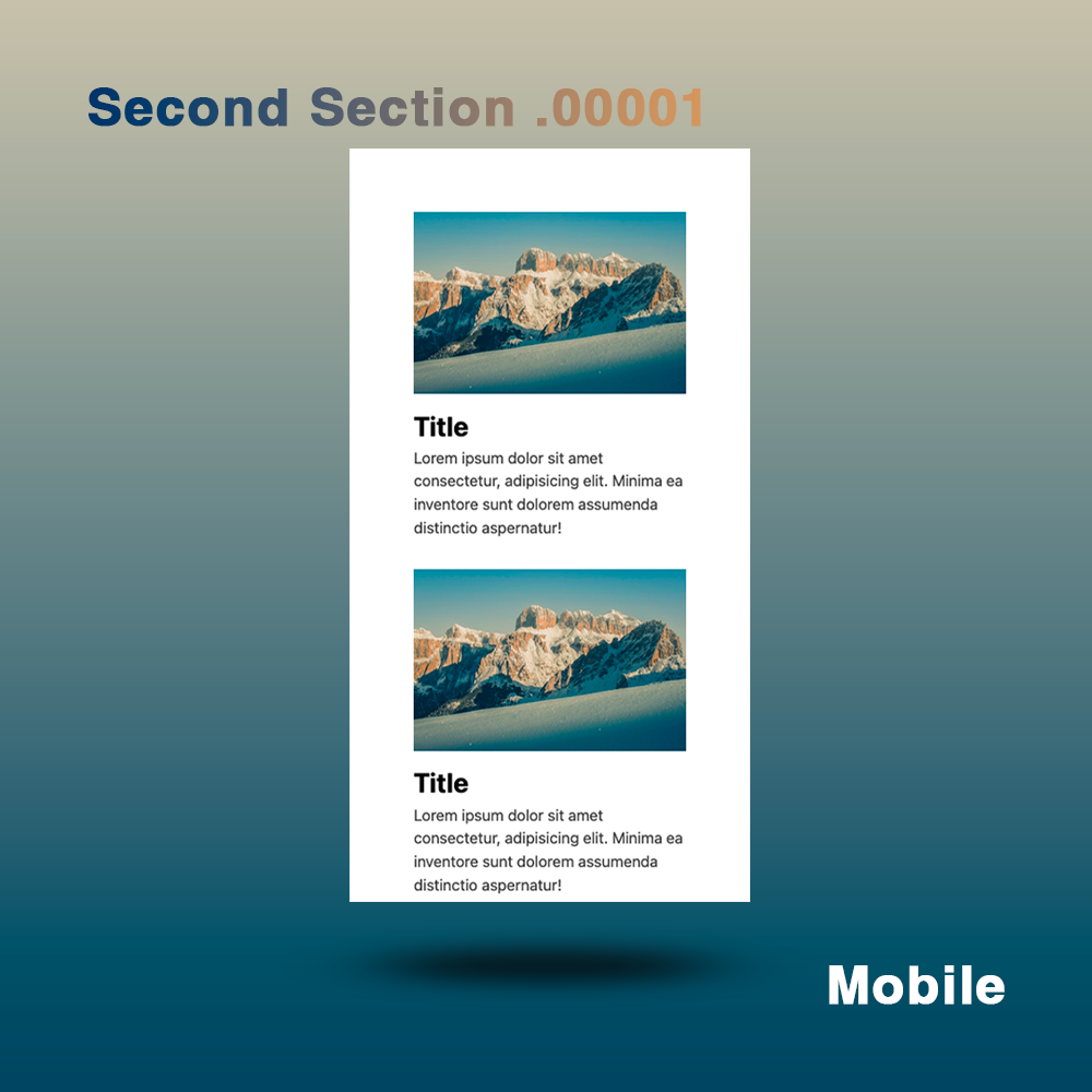
- It uses a three-column layout on desktop, one column on tablet, and one column on mobile.
- Providing the optimal display method for each device, improving usability.
-
A simple and modern grid layout:
- Use a grid layout to organize your content and present it in a visually appealing way.
- Increase the visibility of your products and content, making it easier for users to find information.
-
Visually organized information:
- Provide information through a combination of images, titles, and text, making it easy for visitors to understand.
- Each element is well-balanced, maintaining a sense of unity throughout the design.
-
Responsive:
- Responsive design ensures comfortable viewing on desktop, tablet and mobile devices.
- Provides optimal layout for each device.
Design elements:
-Background and color palette: Simple, subdued colors are used to emphasize visibility and a unified design.
-typography: A modern and simple font is used to achieve both visibility and style.
-Layout: A different grid layout is used for each device, organizing information in an easy-to-understand manner.
◆Place of use: Second section onwards
◆Language [Language used]: html, css
◆File Structure:
[ Usual Web Page】
...
your project/
├── css
│ ├── reset.css
│ └── style.css
├── docs
│ ├── ReadMe_en.md
│ ├── ReadMe_en.pdf
│ ├── ReadMe_jp.md
│ └── ReadMe_jp.pdf
├── image
│ ├── image01.jpg
│ └── smiley.jpg
├── index.html
└──js
└── main.js
...
5 directories, 10 files
[Shopify]
...
your project/
├── assets
│ ├── css
│ │ ├── reset.css
│ │ └── sec_section_00001_style.css
│ └── js
├── docs
│ ├── ReadMe_en.md
│ ├── ReadMe_en.pdf
│ ├── ReadMe_jp.md
│ └── ReadMe_jp.pdf
├── image
│ ├── image01.jpg
│ └── smiley.jpg
└── second00001.liquid
...
6 directories, 9 files
Materials
Materials
Shipping & Returns
Shipping & Returns
Dimensions
Dimensions
Care Instructions
Care Instructions
Share
![[Simple Grid Layout] Section Design | Section Design](http://artiqova.site/cdn/shop/files/secondSection00001.png?v=1721454530&width=1445)
![[Simple Grid Layout] Section Design | Section Design](http://artiqova.site/cdn/shop/files/desktop.png?v=1721454530&width=1445)
![[Simple Grid Layout] Section Design | Section Design](http://artiqova.site/cdn/shop/files/tablet.png?v=1721454529&width=1445)
![[Simple Grid Layout] Section Design | Section Design](http://artiqova.site/cdn/shop/files/mobile.png?v=1721454530&width=1445)
