TsUMIKI
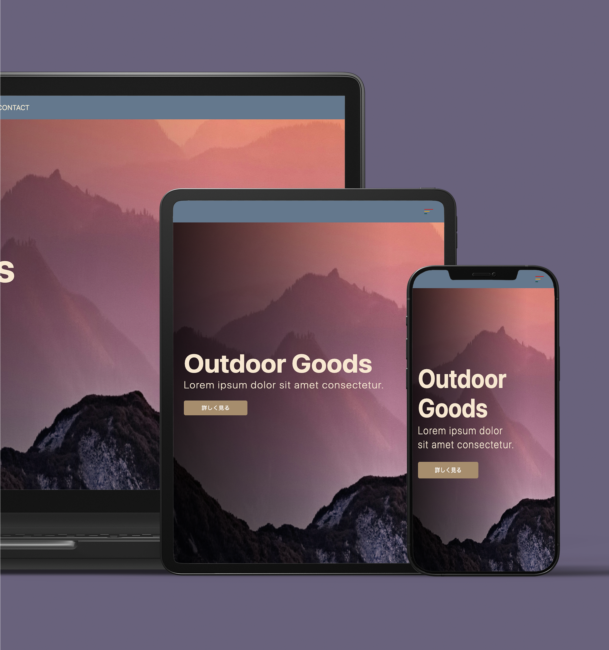
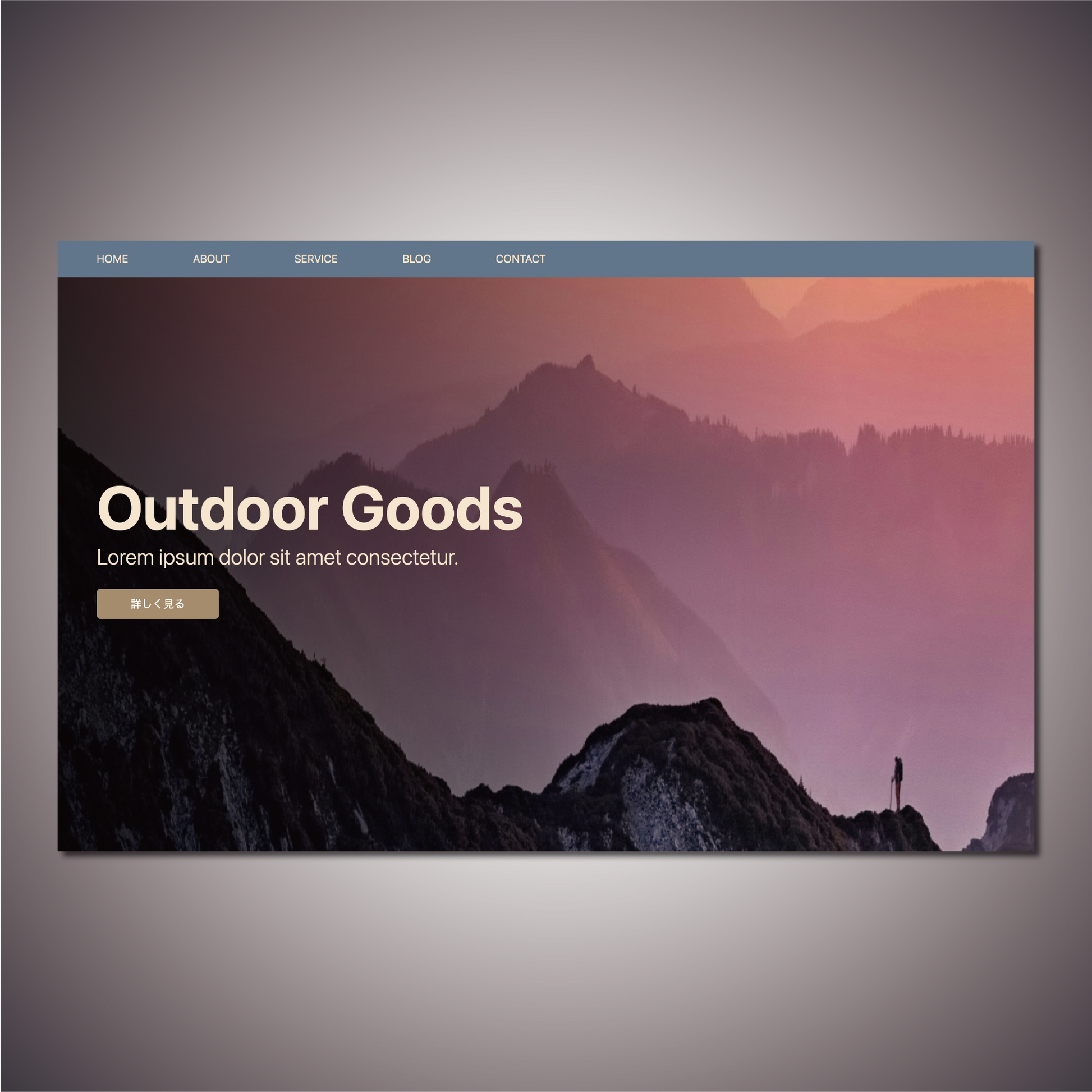
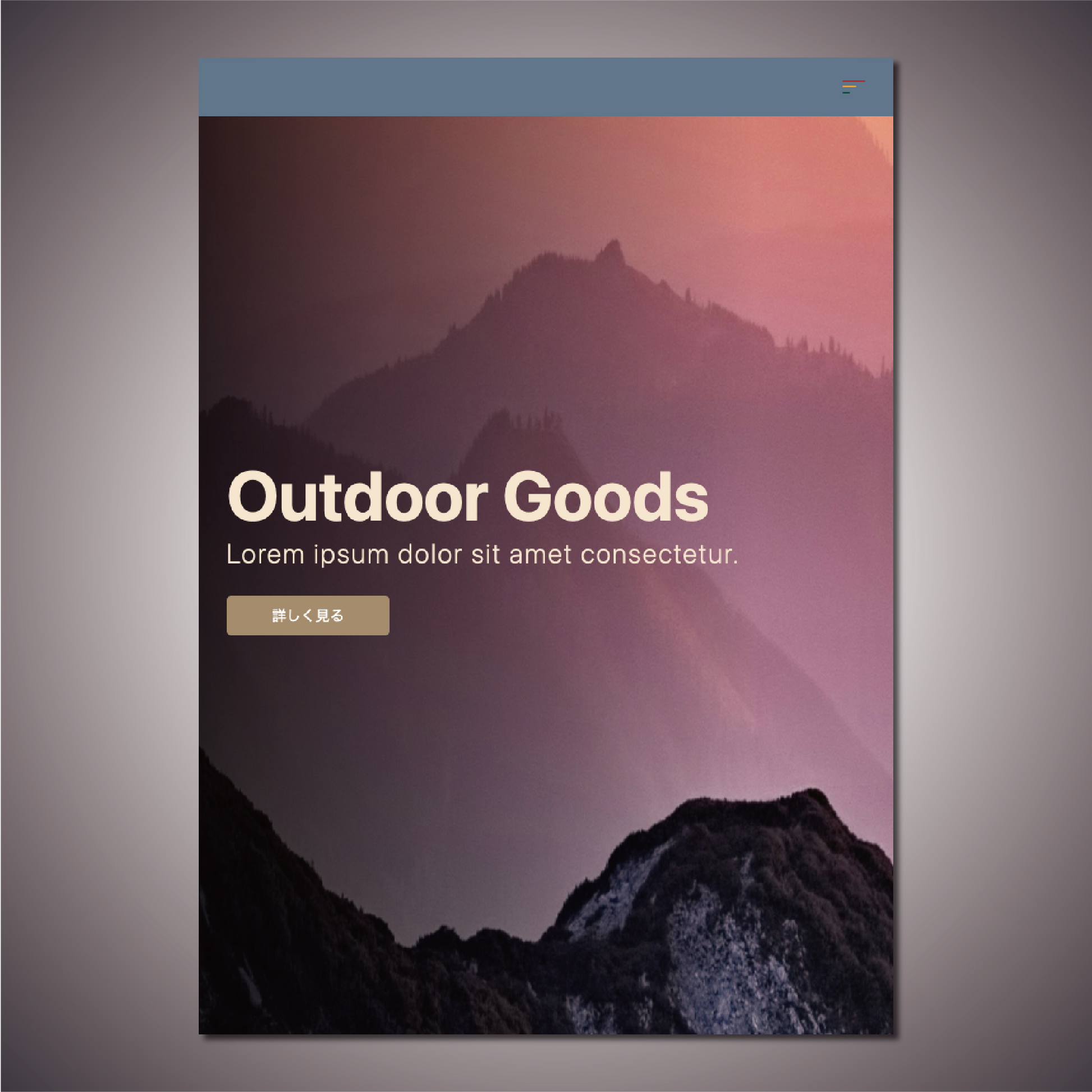
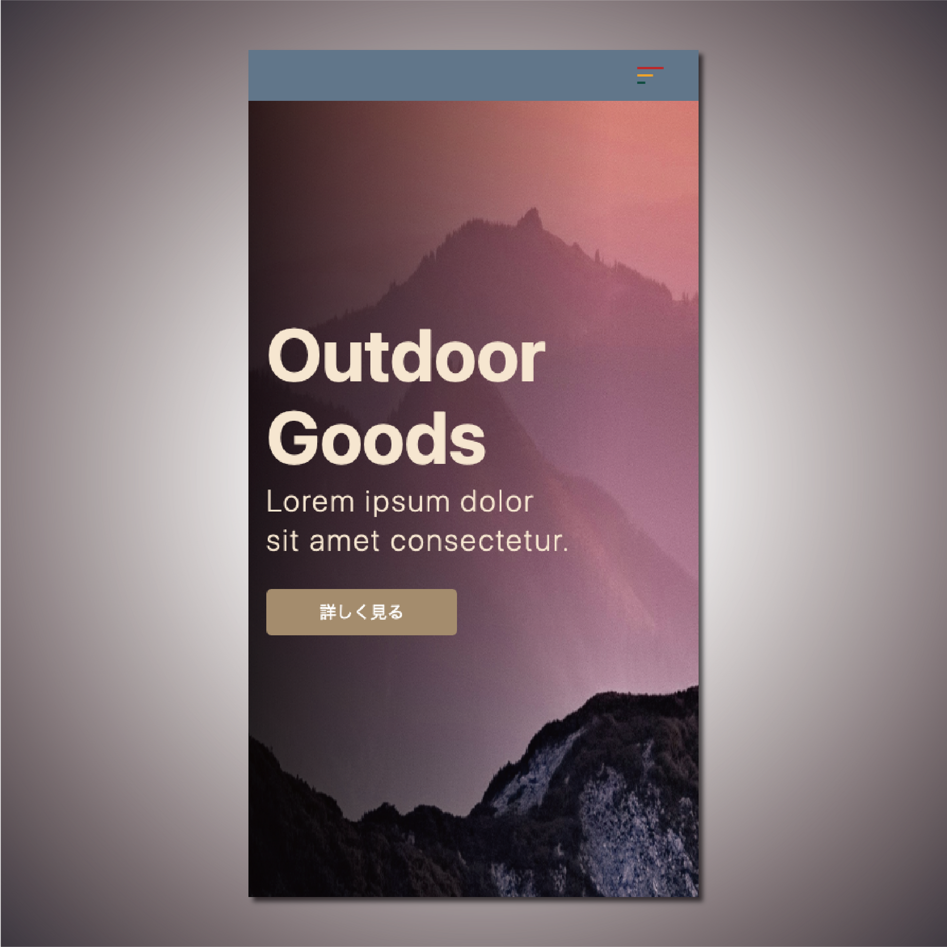
[OutDoor] First View Section Design
[OutDoor] First View Section Design
Couldn't load pickup availability
Product Name: OutDoor
Model: NO.4
◆Concept: Outdoor
◆Date of Creation [Date of Creation]: 2024/04/04
◆Characteristics
- Imagine selling outdoor products
- Masculine design
- Slide text with Swiper
- Gradient layer animation from the left
- You can freely enter the title and company name.
- Subtitle can be freely entered
- Linkable via button
- Regular website version: with header
- Shopify version: No header
- With header, with dynamic hamburger menu
- Regular website version: with header
- Shopify version: No header
◆Outline [Overview/Concept]
The design is designed to evoke the outdoors.
The concept is "outdoors" | Outdoor
overview:
The "Outdoor" concept is a web design top image and purpose for selling outdoor goods. It emphasizes the grandeur and masculinity of the mountains, providing visitors with a dynamic and powerful experience.
Points to keep in mind:
-
Outdoor sales site:
- We focused on displaying products, especially outdoor equipment, in an attractive way.
- Create product categories and feature pages to help visitors easily find the products they're looking for.
-
Deep Mountain Magnificence:
- Uses plenty of photos of magnificent mountains and natural landscapes to inspire a sense of adventure in visitors.
- Use large background images and videos to create compelling visuals.
-
Masculine:
- The design incorporates masculine and powerful elements, giving it a sophisticated impression.
- Fonts and colors are strong and masculine in style.
-
Dynamic and spectacular:
- Dynamic design with large headlines, images and interactive elements.
- Enhance visual impact with dynamic layouts and effects.
-
Watermark layer sliding in from the left:
- The watermark layer slides from the left in an animation, creating a sense of movement.
- Layers slide to give the page depth.
-
Slide text with Swiper:
- Use Swiper.js to slide text and content.
- Implement interactive and visually appealing sliders.
-
Link from a button:
- Make each button a clear link and make it easy for visitors to take the next step.
- The buttons are designed to be visually prominent and easy to click.
Design elements:
- Background and color palette: Masculine colors based on dark greens, browns, and grays.
- Typography: A powerful sans serif font is used to ensure both visibility and impact.
-Layouts: Dynamic layouts with large background images or videos at the center.
- Animation: Emphasize dynamic elements by incorporating a watermark layer slide from the left and text slides using Swiper.
◆Place of use: As the top of the page
◆Language [Language used]: html, css, javascript
◆File Structure:
【Usual Web Page】
...
your project/
├── css
│ ├── reset.css
│ └── style.css
├── docs
│ ├── ReadMe_en.md
│ ├── ReadMe_en.pdf
│ ├── ReadMe_jp.md
│ └── ReadMe_jp.pdf
├── image
│ └── outdoorSampleImage.png
├── index.html
└──js
└── main.js
...
5 directories, 9 files
[Shopify]
...
your project/
├── assets
│ ├── css
│ │ ├── outdoor-style.css
│ │ └── reset.css
│ └── js
│ └── outdoor_main.js
├── docs
│ ├── ReadMe_en.md
│ ├── ReadMe_en.pdf
│ ├── ReadMe_jp.md
│ └── ReadMe_jp.pdf
├── image
│ └── outdoorSampleImage.png
└── outdoor.liquid
...
7 directories, 9 files
Materials
Materials
Shipping & Returns
Shipping & Returns
Dimensions
Dimensions
Care Instructions
Care Instructions
Share
![[OutDoor] First View Section Design](http://artiqova.site/cdn/shop/files/outdoor.png?v=1716818472&width=1445)
![[OutDoor] First View Section Design](http://artiqova.site/cdn/shop/files/outdoorPc.png?v=1716818343&width=1445)
![[OutDoor] First View Section Design](http://artiqova.site/cdn/shop/files/outdoorTablet.png?v=1716818343&width=1445)
![[OutDoor] First View Section Design](http://artiqova.site/cdn/shop/files/outdoorMobile.png?v=1716818343&width=1445)
