TsUMIKI
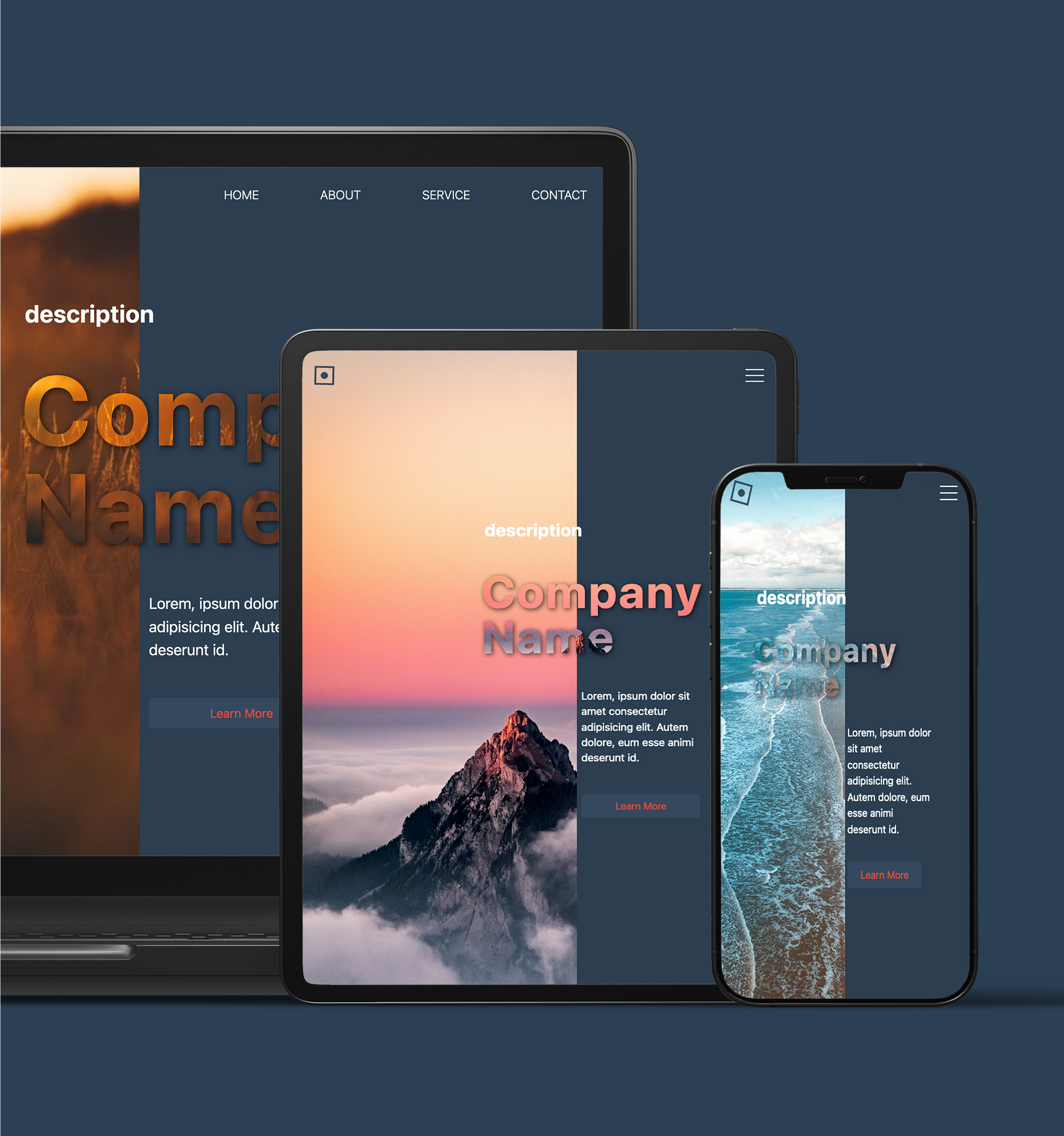
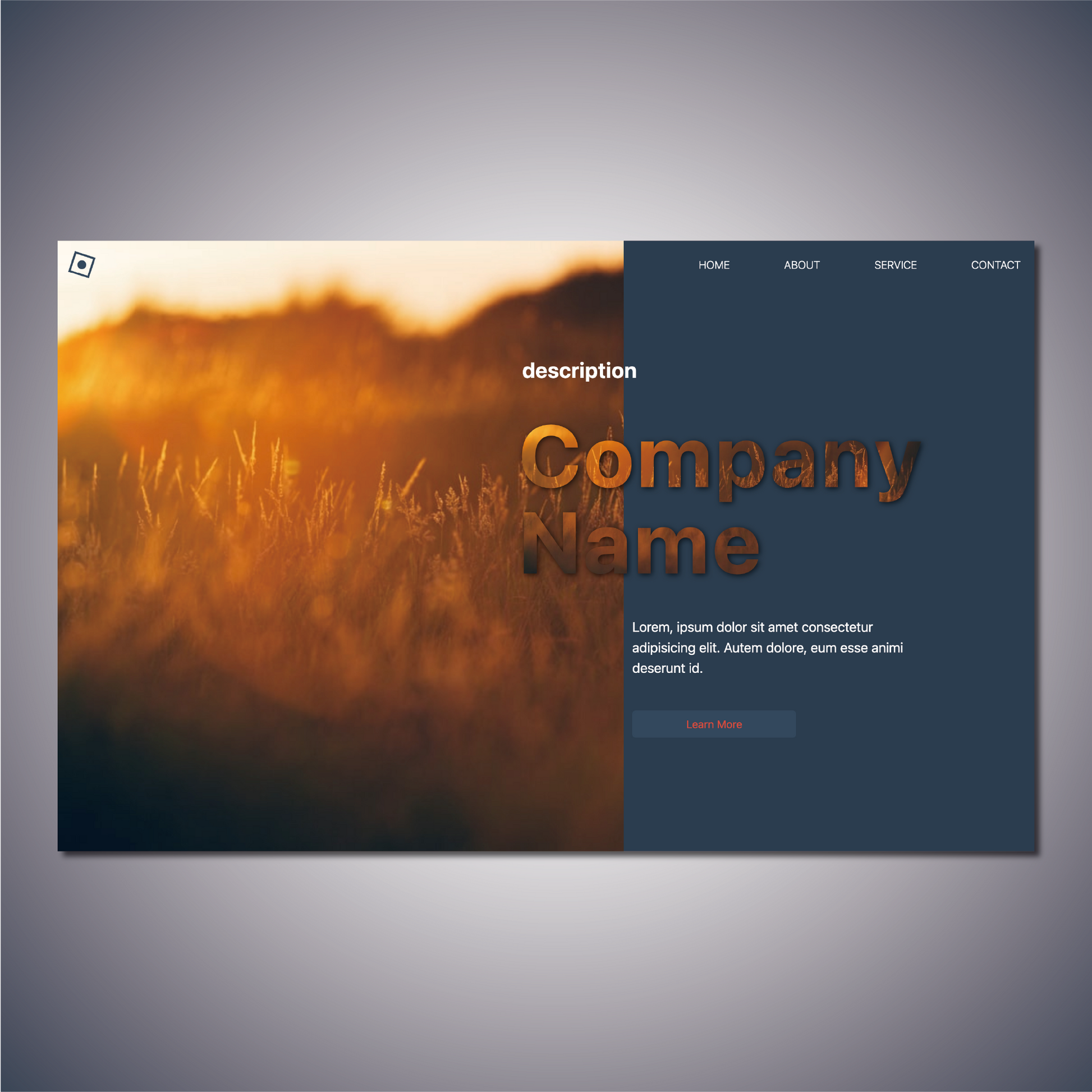
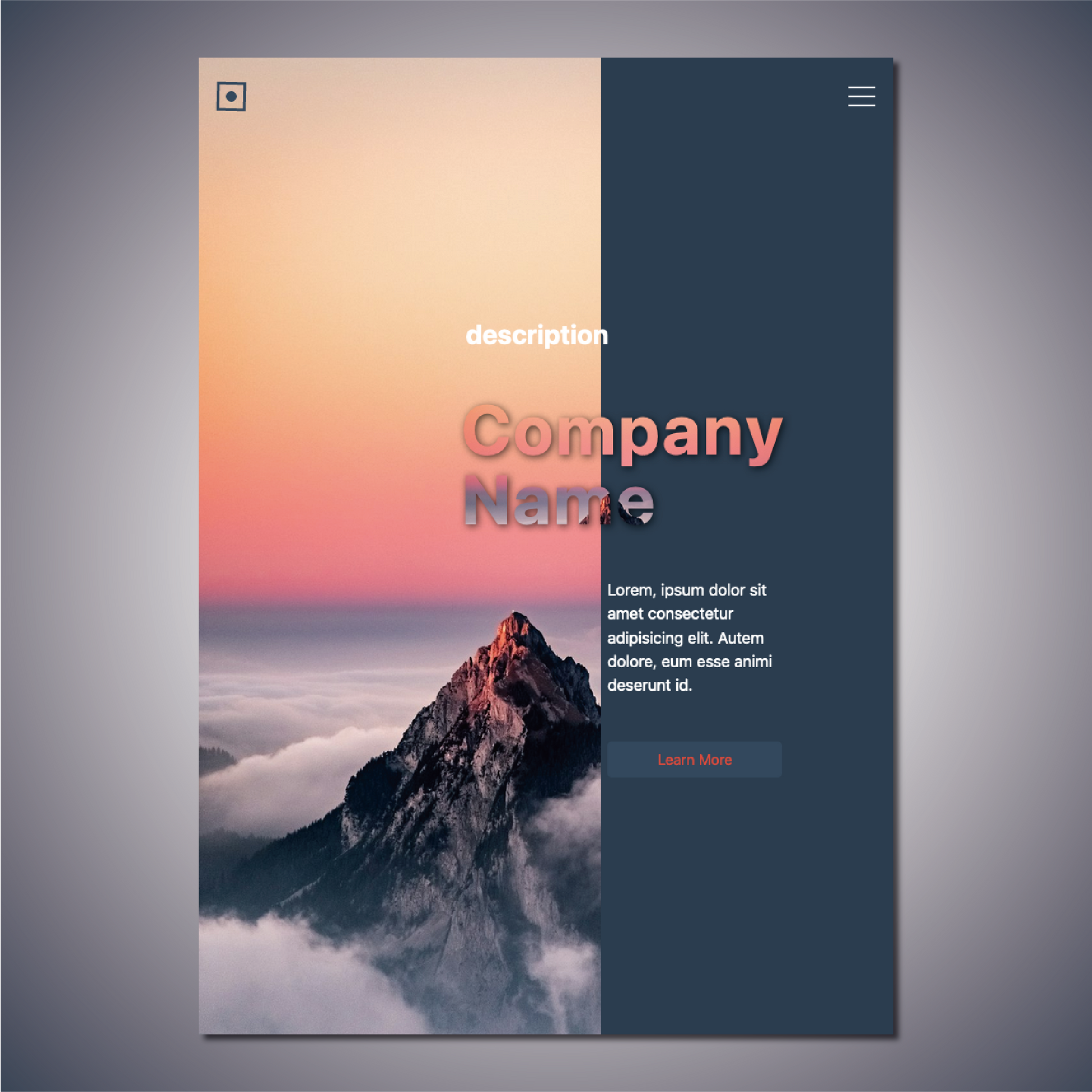
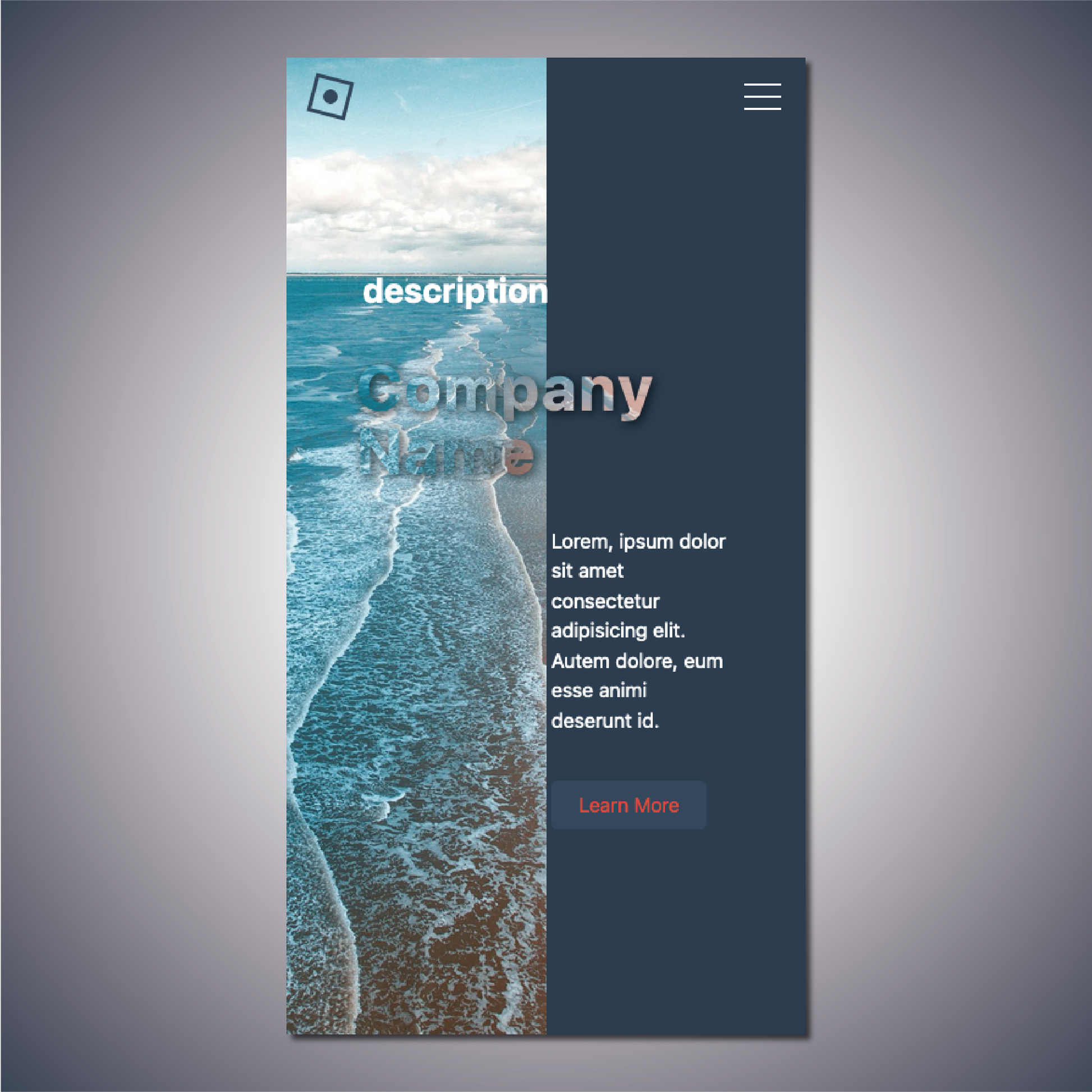
[Glass] First View Section Design
[Glass] First View Section Design
Couldn't load pickup availability
Product Name: GLASS
Model: NO.2
◆Concept: Behind the Glass
◆Date of Creation [Date of Creation]: 2024/04/07
◆Characteristics
- Logo rotation animation
- A masculine color, but with a hint of femininity
- It's like you can see through the glass to the other side.
- The main title is emphasized by shifting the left-right ratio and adding color only to the right side.
- You can freely enter the title and company name.
- Subtitle and text can be freely entered
- Linkable via button
- Regular website version: with header
- Shopify version: No header
- With header, with dynamic hamburger menu
- Responsive
◆Outline [Overview/Concept]
The design is designed to evoke an image of "neutrality."
The concept is "Behind the Glass"
overview:
The concept of "GLASS" is a web design with the theme of the scenery that spreads out beyond the glass. Taking advantage of the perspective through the glass, we aim to create a design that gives a sense of transparency and depth. While based on masculine colors, we are conscious of exuding a certain feminine elegance.
Points to keep in mind:
-
Logo rotation animation:
- Rotating animation in the logo creates a sense of movement and dynamism.
- A moving logo will grab visitors' attention and increase brand awareness.
-
Image of a glass that lets you see through to the other side:
- The scenery seen through glass is placed in the background to emphasize transparency and depth.
- Incorporating design elements that evoke the texture of glass to achieve a sense of realism.
-
Emphasizing the main title by shifting the left and right proportions and adding color only to the right side:
- By changing the left and right ratio, visual balance is achieved, while the colored area on the right emphasizes the main title.
- A layout that takes into consideration eye guidance.
-
Responsive:
- Responsive design ensures comfortable browsing on desktop, tablet and mobile devices.
- Provides optimal layout for each device.
-
A masculine color, but with a feminine touch:
- The basic colors are based on masculine shades such as dark blue and gray.
- Soft fonts and design elements add a feminine elegance.
Design elements:
- Background and color palette: Dark blues and grays are the main focus, with lighter accent colors used to create a sense of transparency.
- Typography: Modern, clean fonts are used to ensure both visibility and style.
-Layout: The layout has different left and right proportions to emphasize the view through the glass.
-Animation : Rotating logo animation adds a dynamic element.
◆Place of use: As the top of the page
◆Language [Language used]: html, css, javascript
◆File Structure:
...
your project/
├── css
│ ├── reset.css
│ └── style.css
├── docs
│ ├── ReadMe_en.md
│ ├── ReadMe_en.pdf
│ ├── ReadMe_jp.md
│ └── ReadMe_jp.pdf
├── index.html
└──js
└── main.js
...
4 directories, 8 files
Materials
Materials
Shipping & Returns
Shipping & Returns
Dimensions
Dimensions
Care Instructions
Care Instructions
Share
![[Glass] First View Section Design](http://artiqova.site/cdn/shop/files/glass.png?v=1716818479&width=1445)
![[Glass] First View Section Design](http://artiqova.site/cdn/shop/files/GlassAttention.png?v=1719734989&width=1445)
![[Glass] First View Section Design](http://artiqova.site/cdn/shop/files/glassPc.png?v=1716818407&width=1445)
![[Glass] First View Section Design](http://artiqova.site/cdn/shop/files/glassTablet.png?v=1716818406&width=1445)
![[Glass] First View Section Design](http://artiqova.site/cdn/shop/files/glassMobile.png?v=1716818407&width=1445)
