TsUMIKI
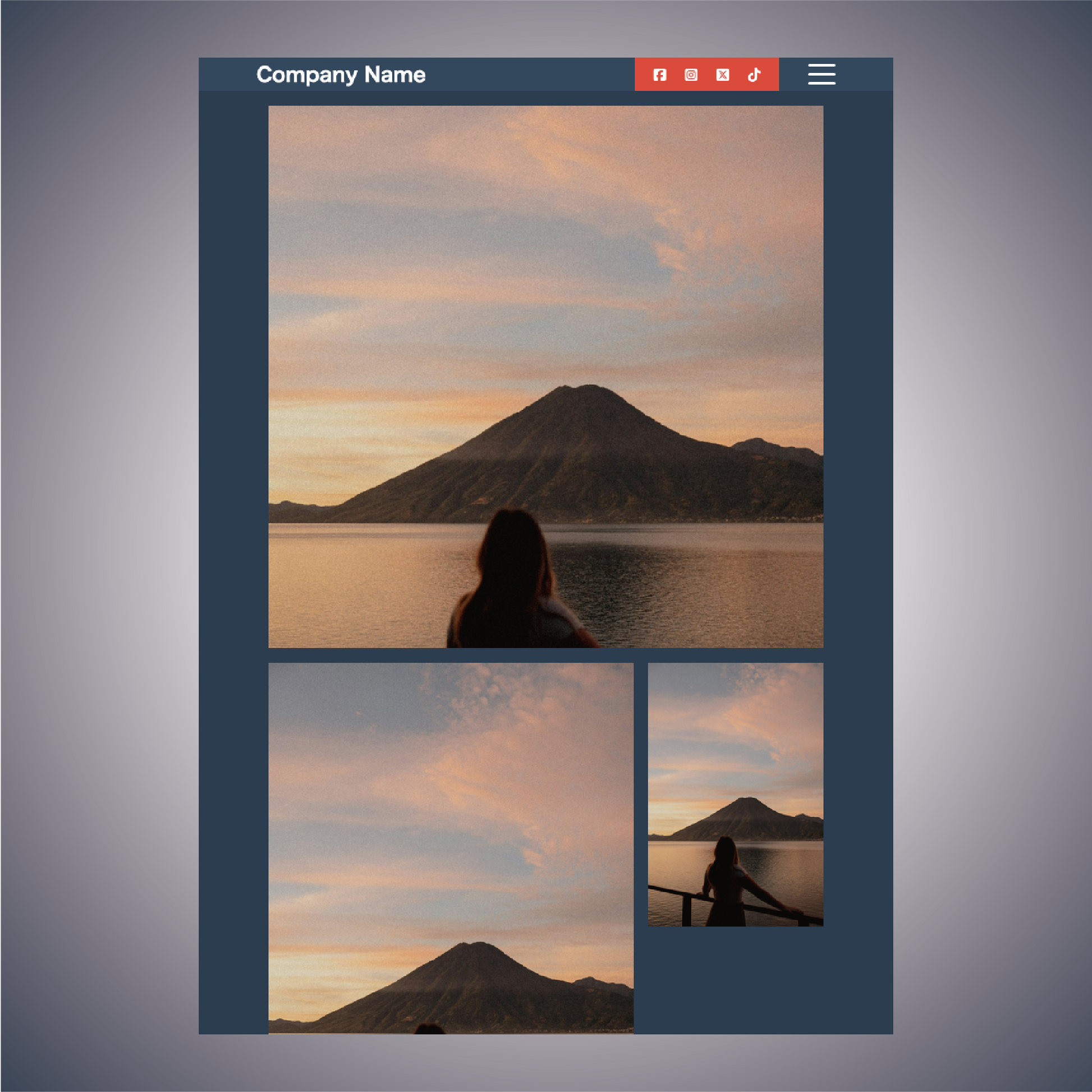
[Gentleman] First View Section Design
[Gentleman] First View Section Design
Couldn't load pickup availability
Product Name: Gentleman
Model: NO.1
◆Concept: Gentleman
◆Date of Creation [Date of Creation]: 2024/04/010
◆Characteristics
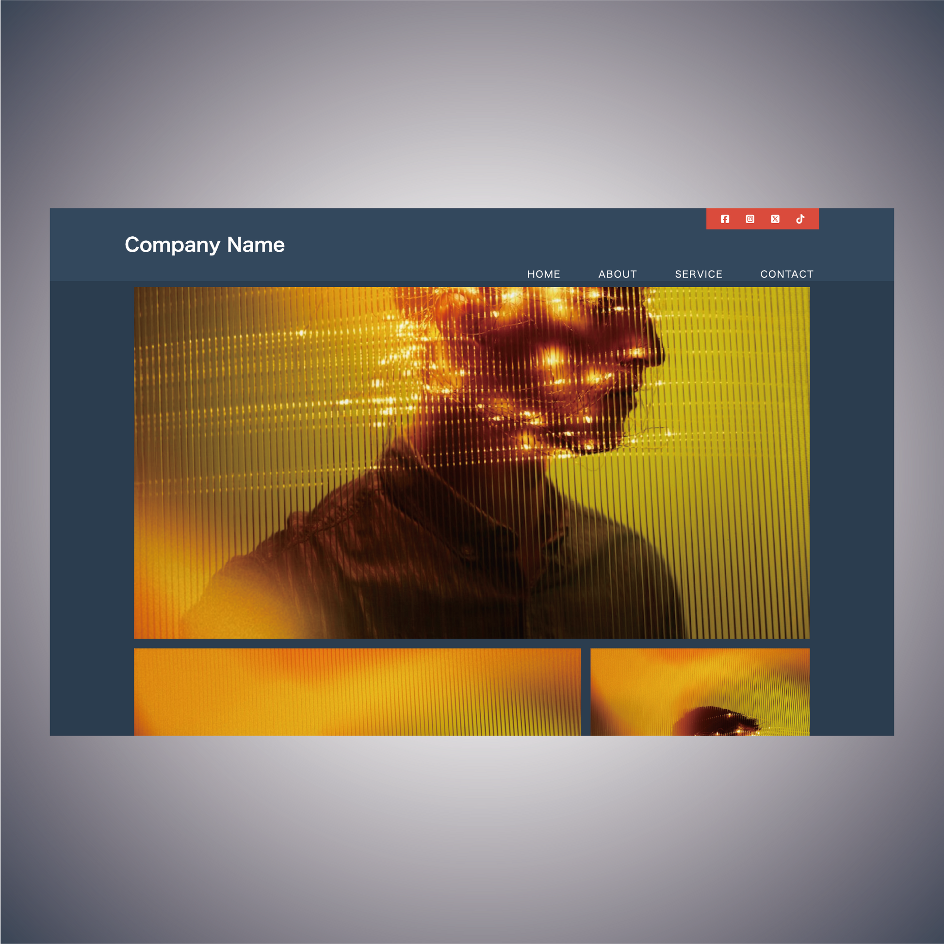
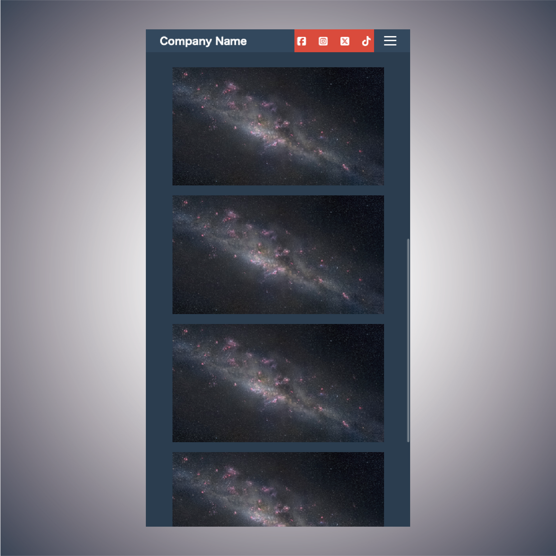
- Images can be posted in a grid
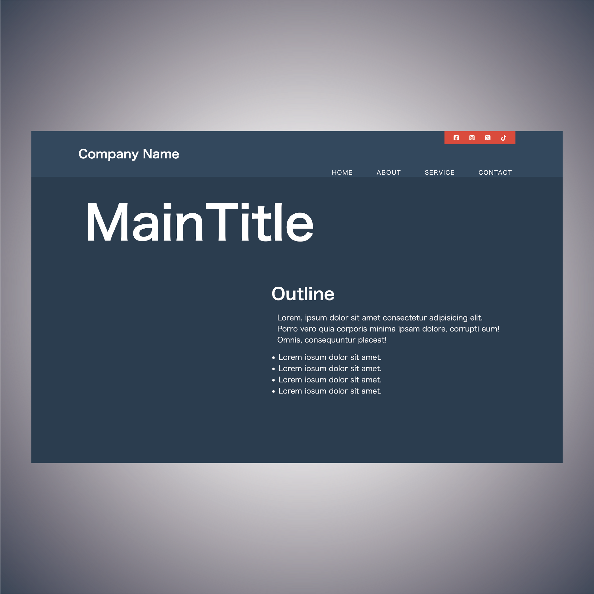
- A gentlemanly website
- By displaying images in a grid, products and other information can be displayed clearly.
- Emphasize by placing SNS icons on top. *Please note that the Shopify version does not have a SNS icon section.
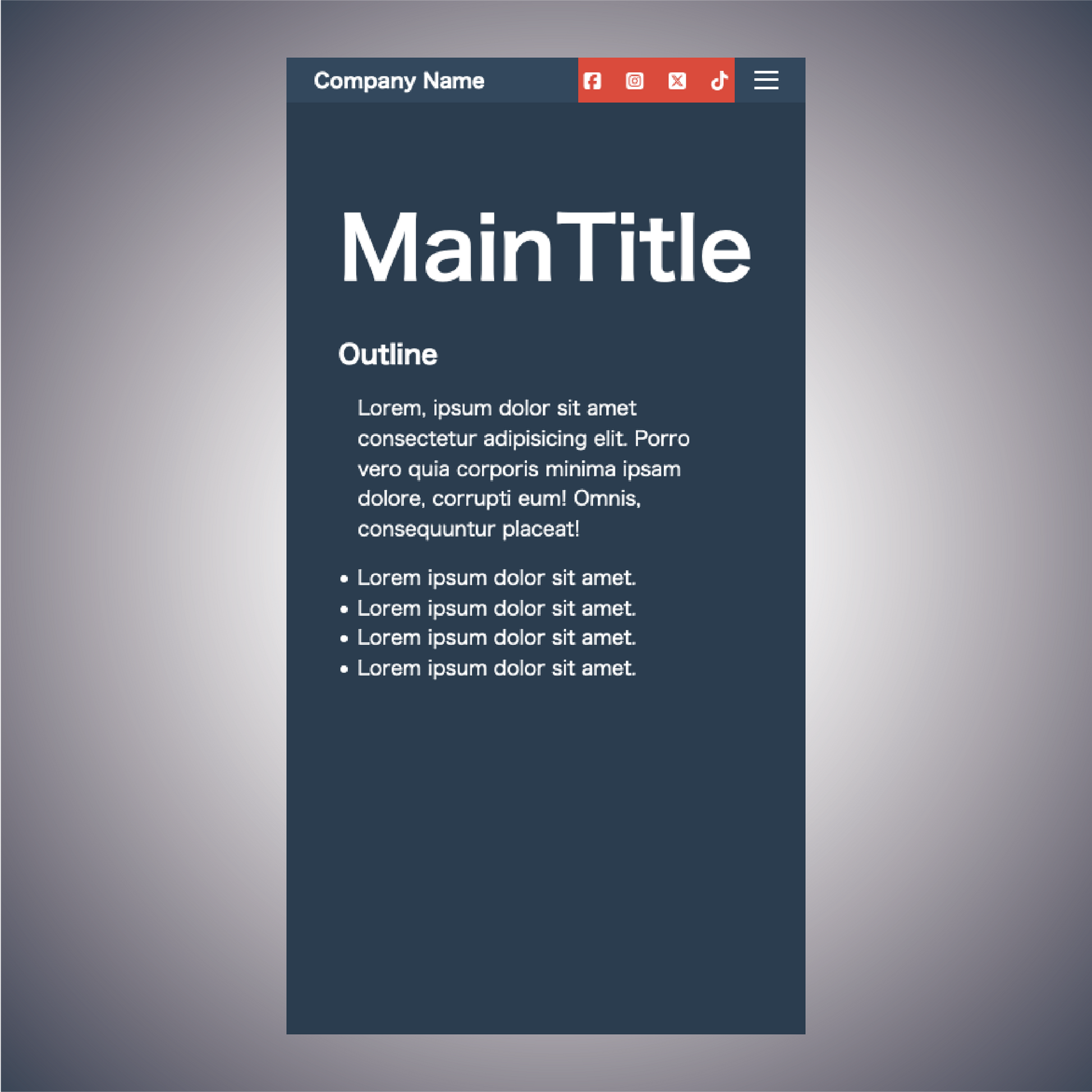
- You can freely enter the title and company name.
- Subtitles, text, and lists can be freely entered
- Linkable from images
- Regular website version: with header
- Shopify version: No header
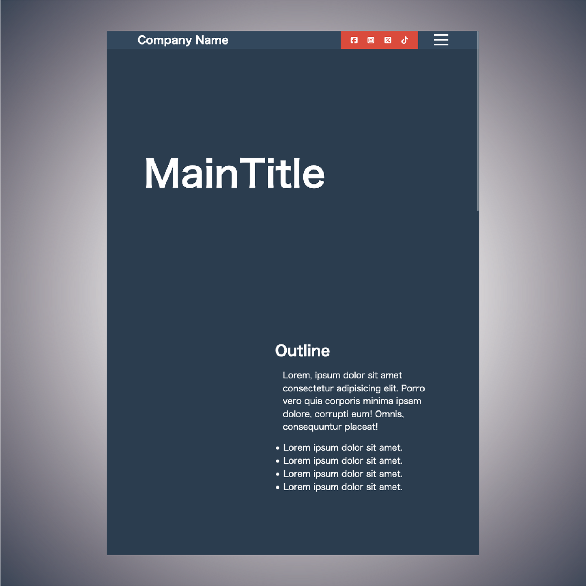
- With header, with dynamic hamburger menu
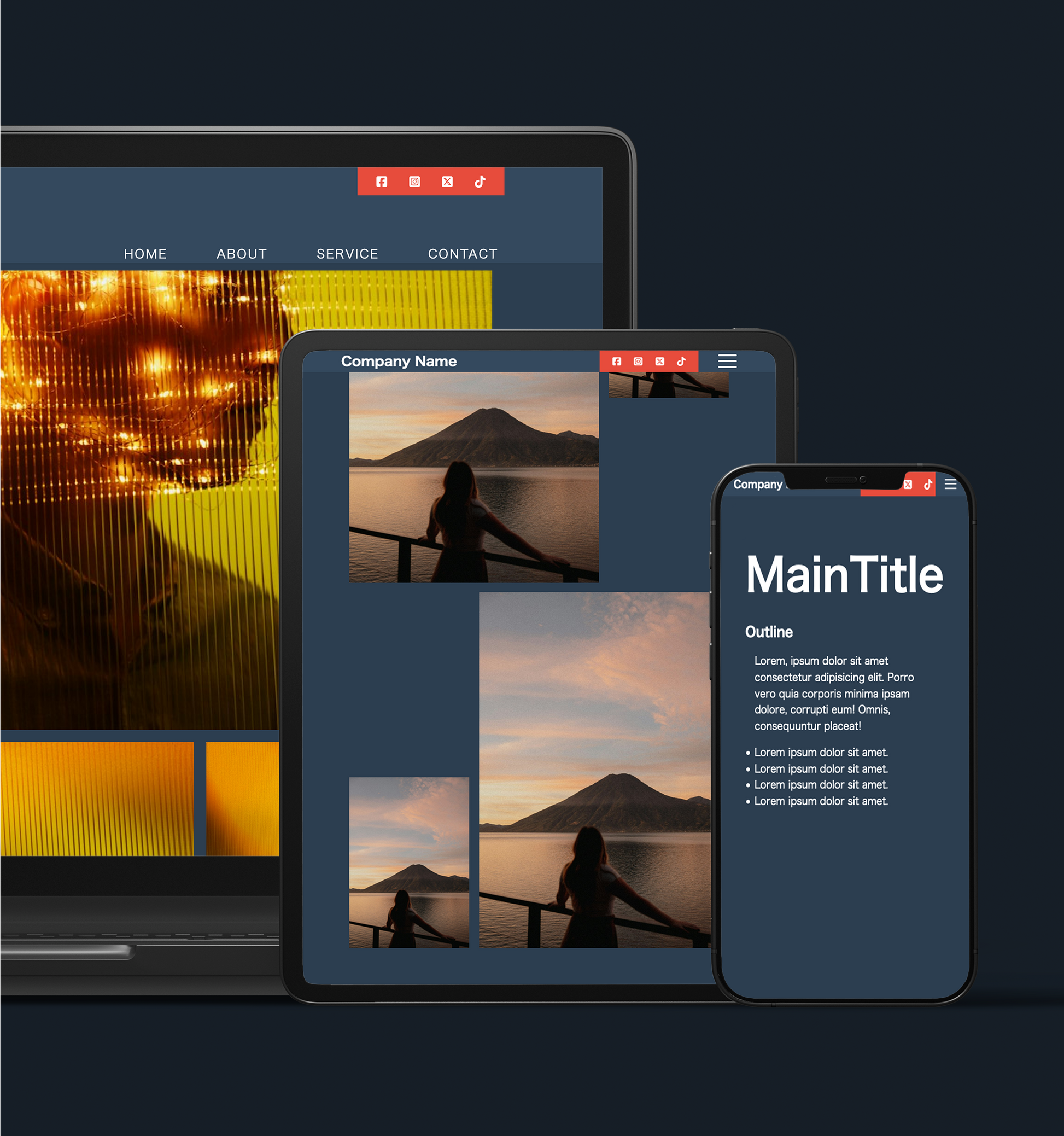
- Responsive
◆Outline [Overview/Concept]
The design is inspired by the image of a gentleman.
The concept is "Gentleman" | Gentleman
overview:
The "Gentleman" concept is a web design with a calm, gentlemanly style theme. It uses a simple and sophisticated grid layout to increase product visibility and ease of navigation. It also emphasizes the integration with social media by making SNS icons prominent.
Points to keep in mind:
-
Images can be posted in the grid:
- Uses a grid layout to organize and display your images and content.
- Organize your products and services visually in a clear way so visitors can easily find information about them. -
Keep in mind a calm and gentlemanly website:
- Uses subdued colors and fonts to create an elegant, gentlemanly atmosphere.
- Simplicity and sophistication throughout the design. -
Emphasize social media icons on top:
- Place social media icons prominently so visitors can easily share on social media.
- The icon design is simple and stylish. -
Images can be linked to:
- Links are set for each image, so that clicking on them will take you to more information or a purchase page.
- Use images as intuitive navigation elements. -
Responsive:
- Responsive design ensures comfortable browsing on desktop, tablet and mobile devices.
- Provides optimal layout for each device.
Design elements:
-Background and color palette: Dark navy and gray tones emphasize a sophisticated and calm atmosphere.
- Typography: Use simple, elegant fonts to improve visibility.
-Layout: A grid layout is used to organize information in an easy-to-understand manner.
-Icons: Social media icons are placed in a prominent location and designed stylishly.
◆Place of use: As the top of the page
◆Language [Language used]: html, css, javascript
◆File Structure:
...
your project
├── css
│ ├── reset.css
│ └── style.css
├── docs
│ ├── ReadMe_en.md
│ ├── ReadMe_en.pdf
│ ├── ReadMe_jp.md
│ └── ReadMe_jp.pdf
├── index.html
└──js
└── main.js
...
4 directories, 8 files
Materials
Materials
Shipping & Returns
Shipping & Returns
Dimensions
Dimensions
Care Instructions
Care Instructions
Share
![[Gentleman] First View Section Design](http://artiqova.site/cdn/shop/files/gentleman.png?v=1716818472&width=1445)
![[Gentleman] First View Section Design](http://artiqova.site/cdn/shop/files/gentlemanPc-01.png?v=1716818424&width=1445)
![[Gentleman] First View Section Design](http://artiqova.site/cdn/shop/files/gentlemanPc-02.png?v=1716818425&width=1445)
![[Gentleman] First View Section Design](http://artiqova.site/cdn/shop/files/gentlemanTablet-01.png?v=1716818424&width=1445)
![[Gentleman] First View Section Design](http://artiqova.site/cdn/shop/files/gentlemanTablet-02.png?v=1716818424&width=1445)
![[Gentleman] First View Section Design](http://artiqova.site/cdn/shop/files/gentlemanMobile-01.png?v=1716818424&width=1445)
![[Gentleman] First View Section Design](http://artiqova.site/cdn/shop/files/gentlemanMobile-02.png?v=1716818425&width=1445)
