TsUMIKI
[Dynamic Blog Integration] Section Design | Section Design
[Dynamic Blog Integration] Section Design | Section Design
Couldn't load pickup availability
Product Name: Second Section lot.00002
Model: NO.2
◆Concept: Dynamic Blog Integration
◆Date of Creation [Date of Creation]: 2024/03/16
◆Characteristics
- The core of the design is set up to automatically update to your latest blog posts when used with Shopify.
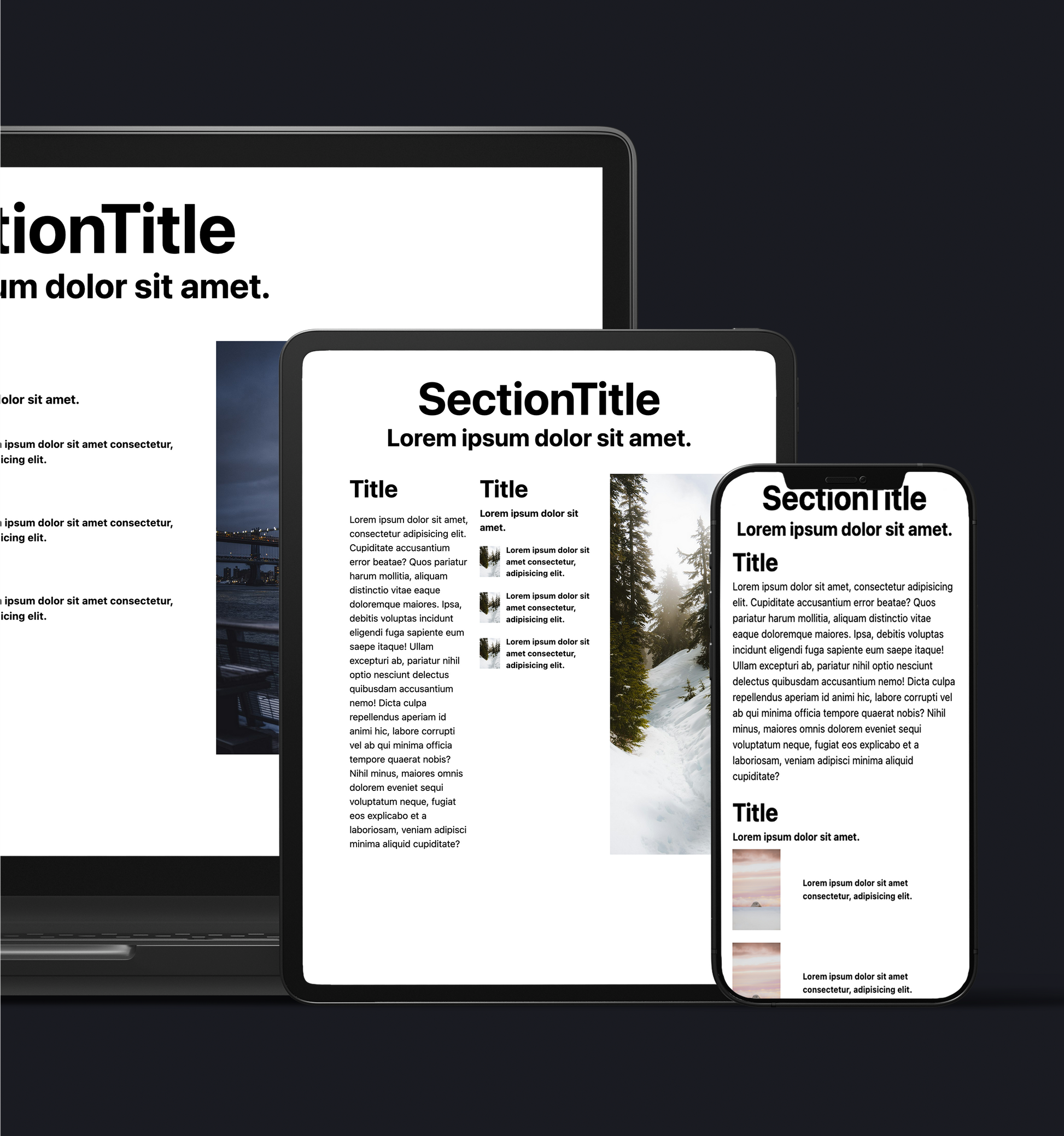
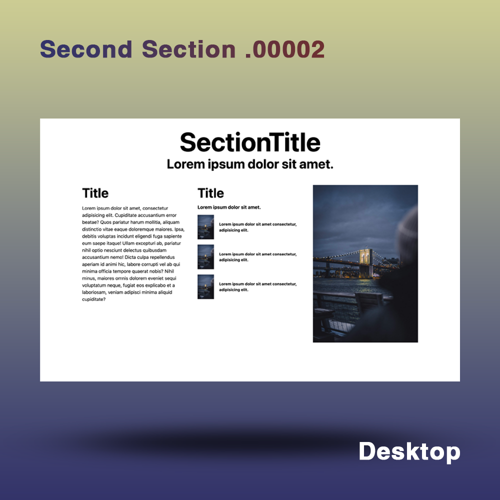
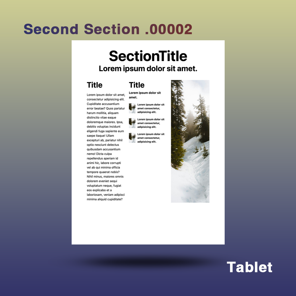
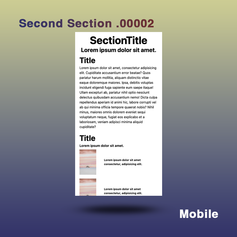
- Layouts adapted for each device (desktop, tablet, mobile).
- It includes a main title, section titles and subtitles.
- A combination of images and text provides visual information.
- A large image is placed on the right side to emphasize the visual impact.
- It is responsive and can be viewed comfortably on any device.
- Linkable via button
- Regular website version: Header / None
- Shopify version: Header / None
◆Outline [Overview/Concept]
The concept is "Dynamic Blog Integration"
overview:
This design is based on the theme of "dynamic blog integration." The latest blog posts are automatically reflected, providing the latest information at all times. It provides an optimal layout for each device and effectively conveys visual information.
Points to keep in mind:
-
Automatic update of latest blog posts:
- When used with Shopify, this setting automatically displays the latest blog post in the center.
- Keep your visitors updated and up-to-date with the latest information.
-
Device-optimized layouts:
- It has a different layout for desktop, tablet and mobile.
- Provides the optimal display method for each device, improving the user experience.
-
Visually organized information:
- Provide information through a combination of main titles, section titles, subtitles, text, and images.
- A large image is placed on the right side to emphasize the visual impact.
-
Linkable buttons:
- Each button should have a link so visitors can easily take the next step.
- The buttons are designed to be eye-catching and easy to click.
-
Responsive:
- Responsive design ensures comfortable viewing on desktop, tablet and mobile devices.
- Provides optimal layout for each device.
Design elements:
-Background and color palette: Simple, subdued colors are used to emphasize visibility and a unified design.
-typography: A modern and simple font is used to achieve both visibility and style.
-Layout: Different layouts are used for each device, organizing the information in an easy-to-understand manner.
-link: Each piece of content should have a link so that visitors can easily access the information they are looking for.
◆Place of use: Can be used from the second level onwards
◆Language [Language used]: html, css, javascript, Liquid
◆File Structure:
【Usual Web Page】
...
your project/
├── css
│ ├── reset.css
│ └── style.css
├── docs
│ ├── ReadMe_en.md
│ ├── ReadMe_en.pdf
│ ├── ReadMe_jp.md
│ └── ReadMe_jp.pdf
├── image
│ ├── image01.jpg
│ ├── image02.jpg
│ ├── image03.jpg
│ ├── image04.jpg
│ └── image05.jpg
├── index.html
└──js
└── main.js
...
5 directories, 13 files
[Shopify]
...
your project/
├── assets
│ ├── css
│ │ ├── reset.css
│ │ └── sec_section_00002_style.css
│ └── js
│ └── sec_section_00002_main.js
├── docs
│ ├── ReadMe_en.md
│ ├── ReadMe_en.pdf
│ ├── ReadMe_jp.md
│ └── ReadMe_jp.pdf
├── image
│ ├── image01.jpg
│ ├── image02.jpg
│ ├── image03.jpg
│ ├── image04.jpg
│ └── image05.jpg
└── secondSection00002.liquid
...
6 directories, 13 files
Materials
Materials
Shipping & Returns
Shipping & Returns
Dimensions
Dimensions
Care Instructions
Care Instructions
Share
![[Dynamic Blog Integration] Section Design | Section Design](http://artiqova.site/cdn/shop/files/secondSection00002.png?v=1721472668&width=1445)
![[Dynamic Blog Integration] Section Design | Section Design](http://artiqova.site/cdn/shop/files/desktop_de0f51fe-e8d4-4875-8f4b-9b4c8e7e85e1.png?v=1721472668&width=1445)
![[Dynamic Blog Integration] Section Design | Section Design](http://artiqova.site/cdn/shop/files/tablet_e130ab8e-180e-40fb-b4bb-7723773986e6.png?v=1721472667&width=1445)
![[Dynamic Blog Integration] Section Design | Section Design](http://artiqova.site/cdn/shop/files/mobile_47da7c39-ab6c-4f09-a887-dd6d3260e32f.png?v=1721472667&width=1445)
