TsUMIKI
[Dynamic Modern Design] Section Design | Section Design
[Dynamic Modern Design] Section Design | Section Design
Couldn't load pickup availability
Product Name: Second Section lot.00003
Model: NO.3
◆Concept: Dynamic Modern
◆Date of Creation [Date of Creation]: 2024/03/16
◆Characteristics
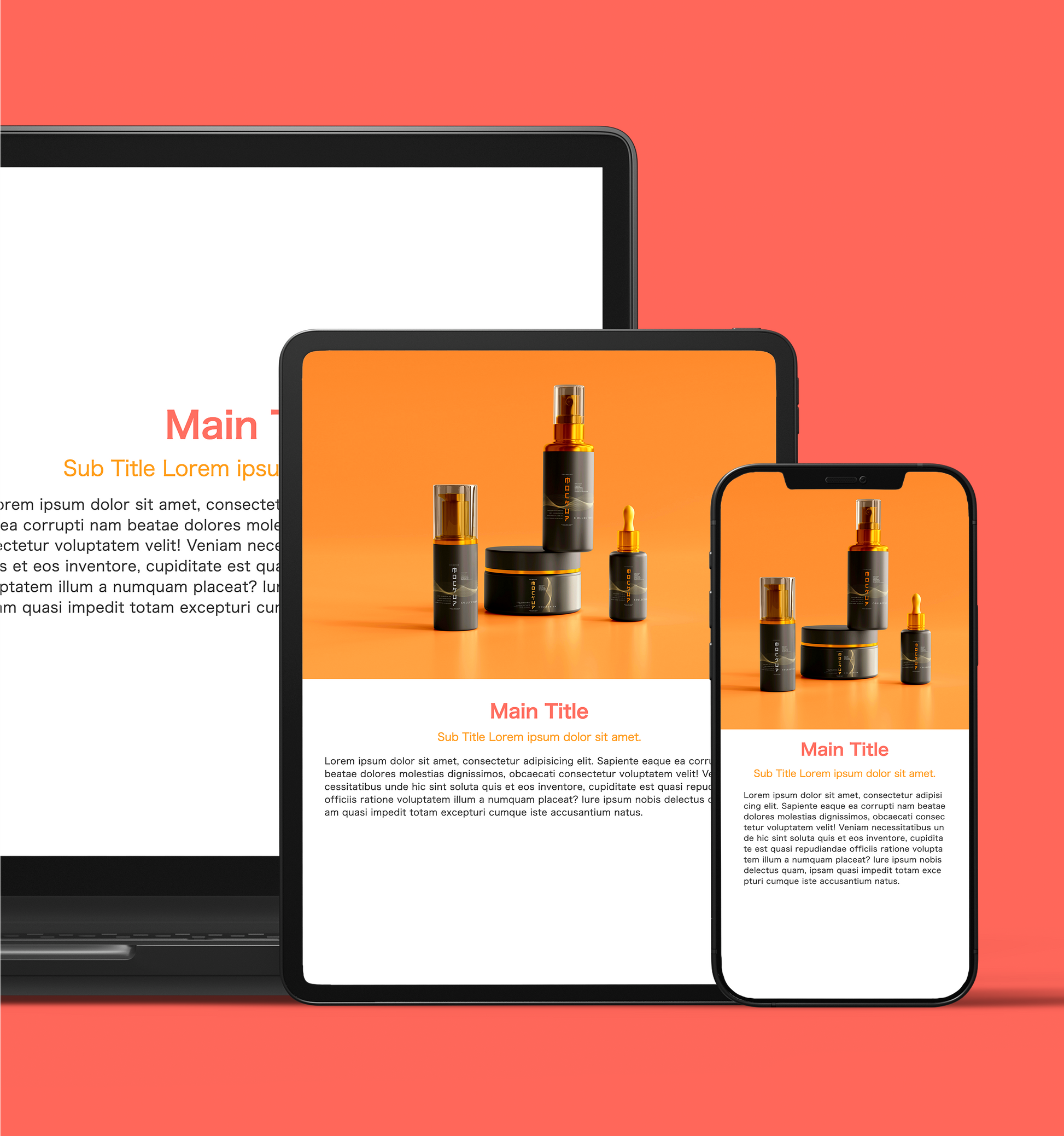
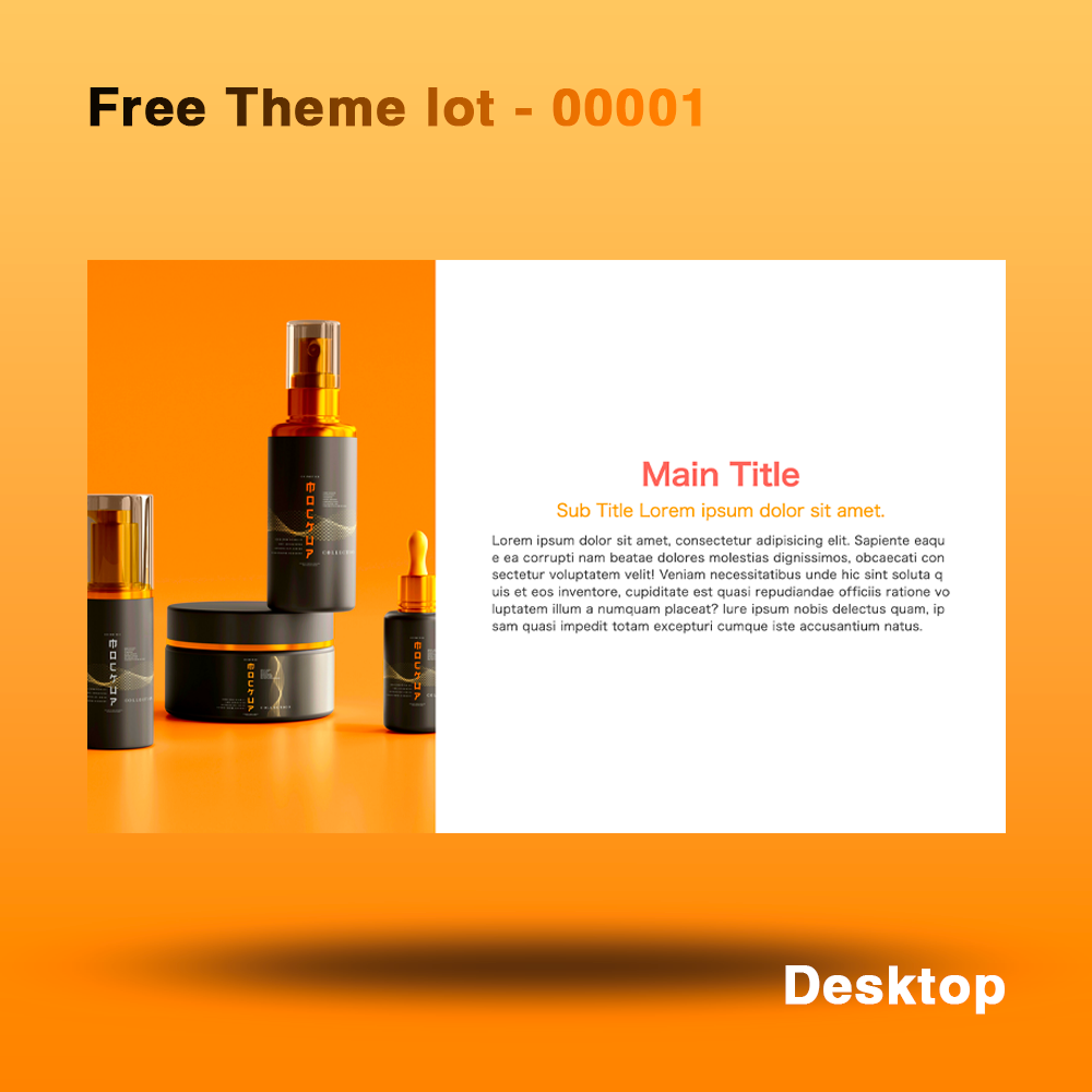
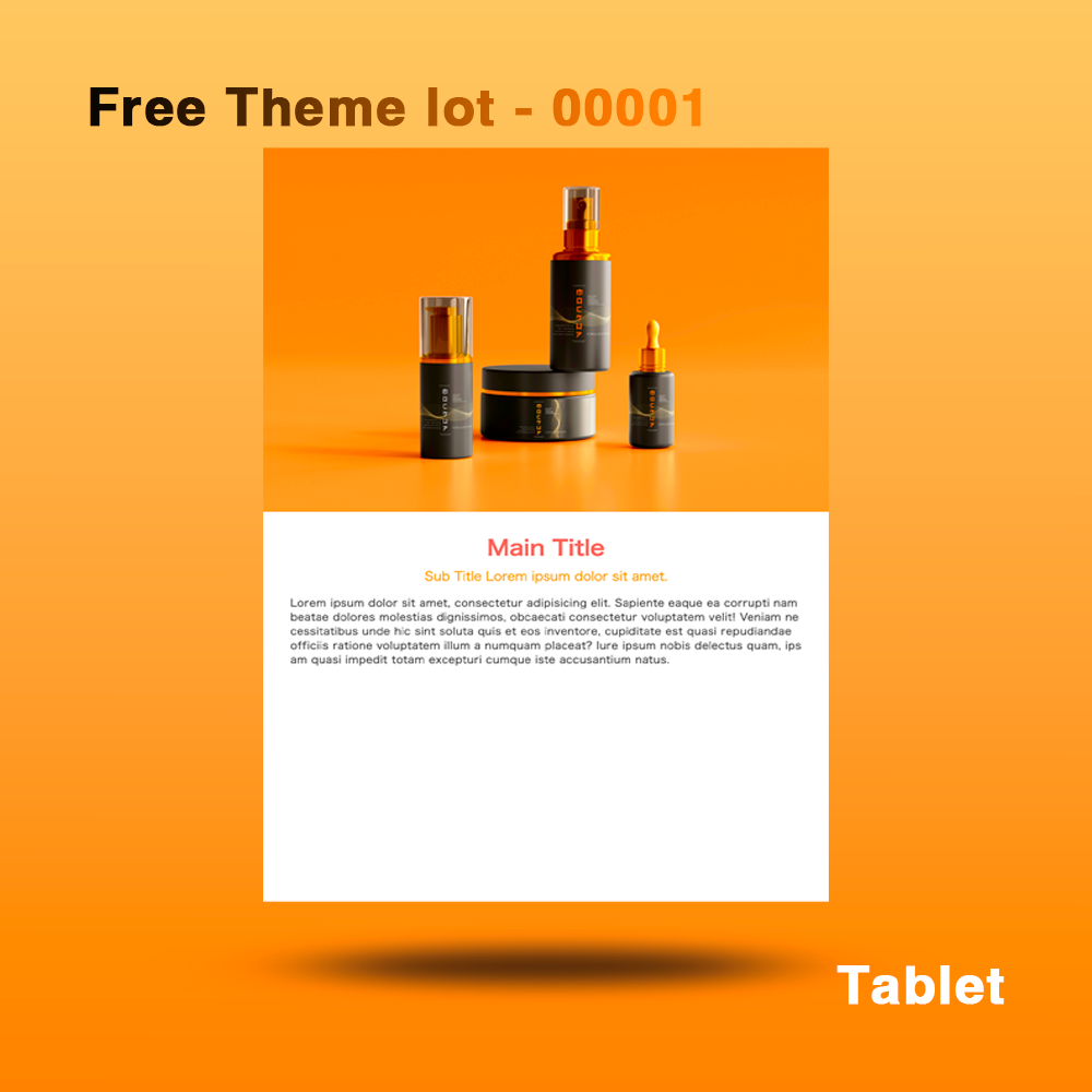
- Responsive design for all devices (desktop, tablet, mobile)
-
Modern coloring gives a stylish impression
-
The image has a blur effect and an animation is added that restores the color and scales up on hover.
-
The layout is symmetrical and visually balanced
-
Use bold typography to highlight key content
- It is responsive and can be viewed comfortably on any device.
- Linkable
- Regular website version: Header / None
- Shopify version: Header / None
◆Outline [Overview/Concept]
The concept is "Dynamic Modern"
A modern and visually appealing design that is simple yet adds movement and interaction to improve the user experience.
overview:
This section design combines modern colors and interactions to provide a visually appealing layout. The device-optimized design allows users to browse the content comfortably on any device. The blur effect and hover state motion draw the user's attention and increase engagement.
Points to keep in mind:
-
Modern use of colors:
- A stylish and sophisticated color scheme is used to unify the tone of the entire site.
-
Image is blurred, color and scales up on hover:
- It grabs users' attention at first glance and keeps them engaged with hover animation.
-
Layout Balance:
- The design appears asymmetrical, yet its symmetrical and orderly layout makes for a visually pleasing design.
-
Linkable:
- Each element should have a link so visitors can easily take the next step.
-
Responsive:
- Responsive design ensures comfortable viewing on desktop, tablet and mobile devices.
- Provides optimal layout for each device.
Design elements:
-Background and color palette: Modern and subdued colours are used to emphasise the sophisticated impression.
-typography: Bold font is used to emphasize the main content. The layout combines visibility and design.
-Layout: The symmetrical layout provides organization and visual balance.
-link: Link design changes on hover, adding interaction that grabs the user's attention.
◆Place of use: Can be used from the second level onwards
◆Language [Language used]: html, css, javascript, Liquid
◆File Structure:
【Usual Web Page】
...
your project/
├── css
│ ├── reset.css
│ └── style.css
├── docs
│ ├── ReadMe_en.md
│ ├── ReadMe_en.pdf
│ ├── ReadMe_jp.md
│ └── ReadMe_jp.pdf
├── image
│ ├── image01.jpg
│ ├── image02.jpg
│ ├── image03.jpg
│ └── image04.jpg
├── index.html
└──js
└── main.js
...
5 directories, 12 files
[Shopify]
...
your project/
├── assets
│ ├── css
│ │ ├── reset.css
│ │ └── sec_section_00003_style.css
│ └── js
│ └── sec_section_00003_main.js
├── docs
│ ├── ReadMe_en.md
│ ├── ReadMe_en.pdf
│ ├── ReadMe_jp.md
│ └── ReadMe_jp.pdf
├── image
│ ├── image01.jpg
│ ├── image02.jpg
│ ├── image03.jpg
│ └── image04.jpg
└── second00003.liquid
...
6 directories, 12 files
Materials
Materials
Shipping & Returns
Shipping & Returns
Dimensions
Dimensions
Care Instructions
Care Instructions
Share
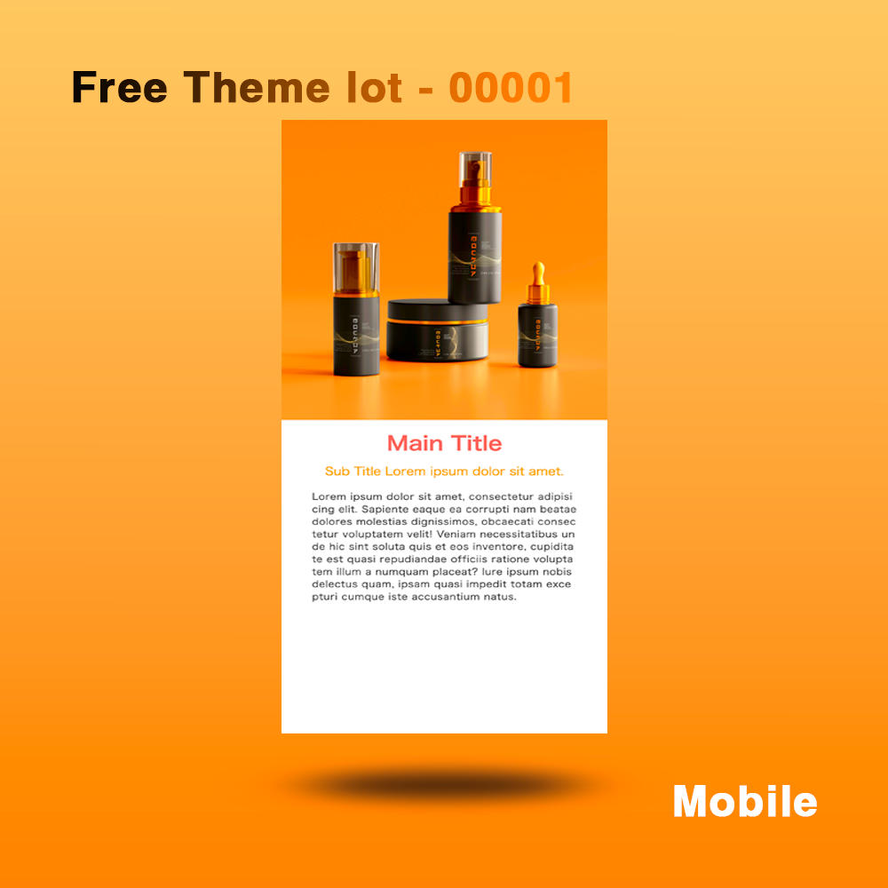
![[Dynamic Modern Design] Section Design | Section Design](http://artiqova.site/cdn/shop/files/free-theme-lot00001.png?v=1724257756&width=1445)
![[Dynamic Modern Design] Section Design | Section Design](http://artiqova.site/cdn/shop/files/free-theme-lot00001-desktop.png?v=1724257756&width=1445)
![[Dynamic Modern Design] Section Design | Section Design](http://artiqova.site/cdn/shop/files/free-theme-lot00001-tablet.png?v=1724257755&width=1445)
![[Dynamic Modern Design] Section Design | Section Design](http://artiqova.site/cdn/shop/files/free-theme-lot00001-mobile.png?v=1724257755&width=1445)
